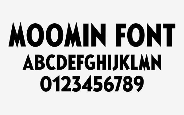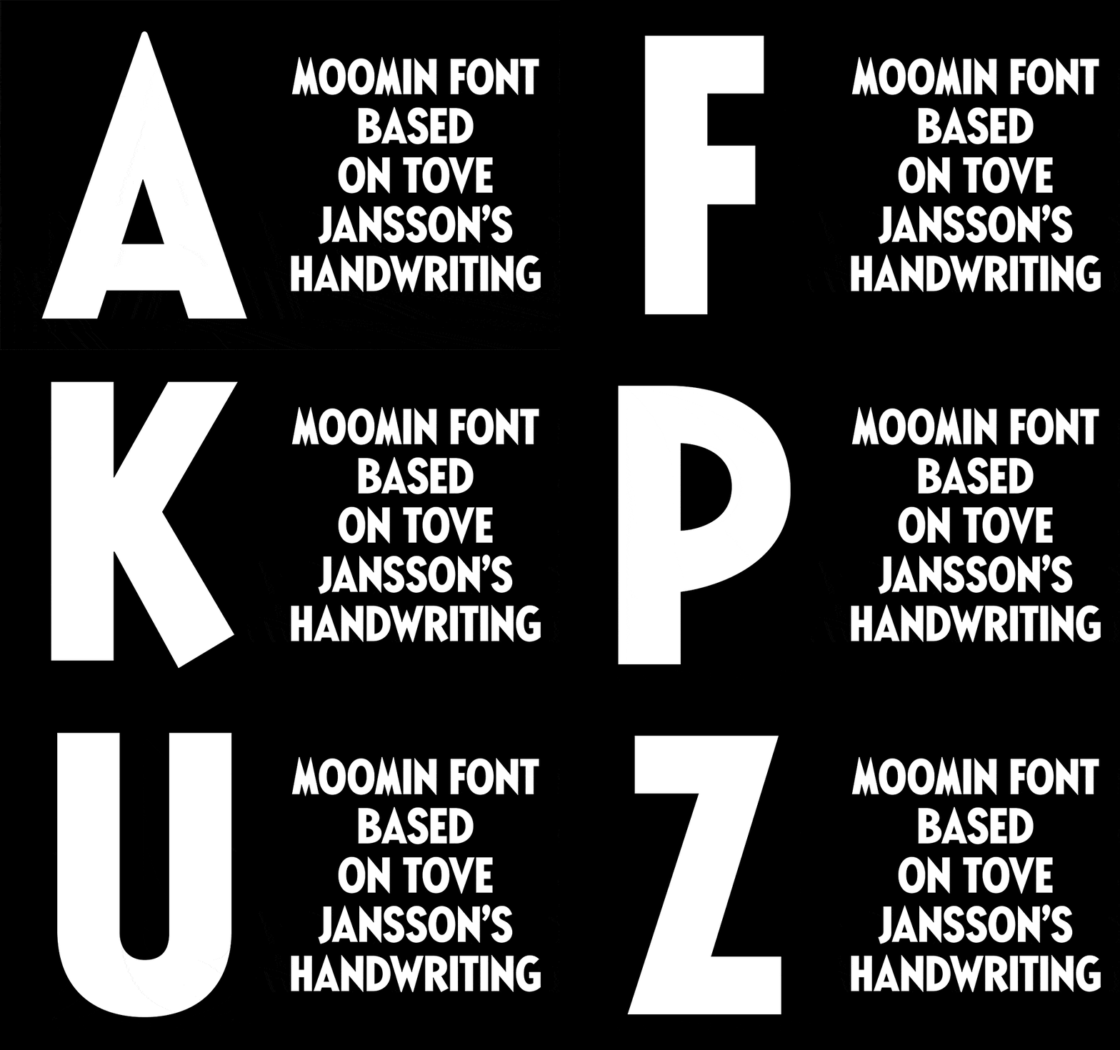
Spotted this morning on It’s Nice That: Finnish creative agency Bond has created a typeface based for the Moomin brand based on Tove Jansson’s hand-drawn comic strip lettering. Given the success of the books that have been collected and reissued by Drawn & Quarterly over the past few years, I’m not surprised that this alphabet has been commissioned. It’s lovely, of course, and really captures the spirit of Jansson’s letterforms without pretending to be hand-drawn.

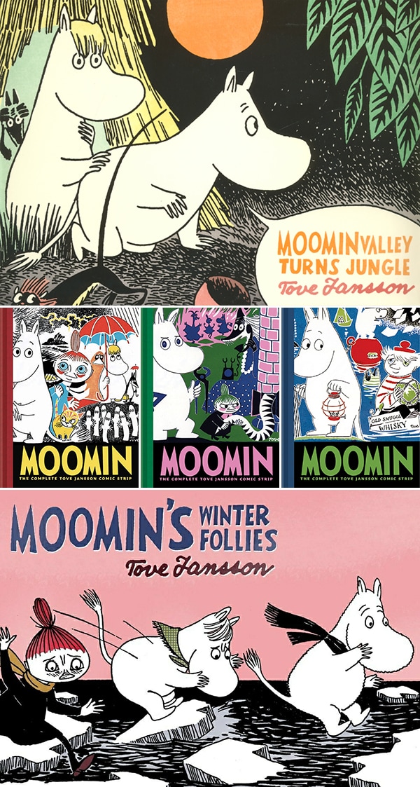
The reissues are all beautifully done, by the way. Story-wise I’m more a fan of the Moomin novels than I am the comic strips, but visually, the comics are pretty phenomenal.
Top: Moomin Valley Turns Jungle
Middle: Moomin: The Complete Tove Jansson Comic Strip, Book One, Book Two, Book Three
Bottom: Moomin’s Winter Follies


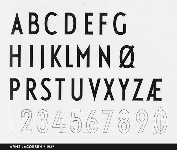
As an aside, I’m fascinated by the similarity between the Moomin Font (and Tover Jansson’s original lettering) and the one designed by Arne Jacobsen for Aarhus City Hall in 1937—currently available printed on lots of gorgeous housewares from Design Letters. I never noticed that before. Those Nords and their pointy-tipped Grotesque typography! Cool.
Typeface graphics via Bond